Notion
Role
UX Designer
UX Designer
Skills
User Interview
User Testing
Wireframing
Prototyping
User Interview
User Testing
Wireframing
Prototyping
Timeline
6 Weeks
6 Weeks
Overview
This was a 6 week case study done for a UX design course at the Emily Carr University of Art and Design. We were given the instructions to investigate a given app or platform and I wanted to choose an app that I frequently used and brainstormed improvements for some interactions within Notion, an all-in-one workplace for online tools.
Introduction
Notion is an all in one workplace that provides a platform for notes, calendars, reminders, and databases, which the user can create their own unique system for project management, note-taking, information management and more. Notion has the ability to share with others, create blocks to organize data, embed links, and endless pages to design.
The planning process can take up the majority of the time. Is there a way to make Notion more seamless and easily understood? How can I make something that is great, even better?
The planning process can take up the majority of the time. Is there a way to make Notion more seamless and easily understood? How can I make something that is great, even better?
How might we improve the Notion interface so that users can more efficiently learn and organize information to increase overall productivity?
Business Goals
Notion is still considered a new and upcoming app. It is necessary to cater the experience to improve retention, referrals and conversion. We need to think about how to create a seamless onboarding process so that the user is more likely to stay and use the app, how to make the experience engaging enough to share it with others, and how to convert users to Notion from their previous platforms.
User Needs
The experience for the user shouldn't involve lots of work on their part. They need a platform that can do it all and is relatively easy to understand. If they find it glitchy or too confusing, they will not continue to use the platform. Especially for an app like Notion, visual aesthetics, a customizable workspace, and organization are key components, however, if they are not working efficiently together, it will not satisfy the goals of the user.
Interviews
“I use Notion for organizing my life, to do lists, habit tracking, and quick notes I might need.”
“Good, sometimes glitchy. I can organize the way I want it to appear, 8/10, not for notes for school but other things.”
“At the very beginning, it was really confusing. There are so many options I feel overwhelmed on what I should do.”
Findings

Compling the interviews together, I took notes on important feedback and grouped them together to find common themes. I wanted to know why people were using Notion, how they were using it, how they found the experience, and general pros and cons. All interviewees had used Notion before and continue to use it, therefore there were a lot of pains that accumulated over time.
Persona

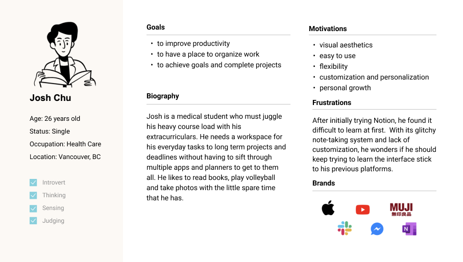
This is where I created Josh. Josh is a millennial who has a very busy schedule and is looking for a platform that can help him organize all his life. He has tried Notion before but found it difficult to keep using as he didn't have enough time to fully understand it and was spending too much time figuring out the kinks than actually using it.
Insights
Opportunities
Insight 1
Initial onboarding can be intimidating and databases and functions aren’t thoroughly explained.
Initial onboarding can be intimidating and databases and functions aren’t thoroughly explained.
Insight 2
Note taking can be limiting for longer notes because of its glitchy blocks and toolbar.
Note taking can be limiting for longer notes because of its glitchy blocks and toolbar.
Insight 3
Pages are difficult to navigate through and users want to share their space more efficiently.
Pages are difficult to navigate through and users want to share their space more efficiently.
Opportunity 1
Creating an engaging tutorial system to walk the user through the necessary steps to get started and provide relevant resources.
Creating an engaging tutorial system to walk the user through the necessary steps to get started and provide relevant resources.
Opportunity 2
Integrate a toolbar to allow for editing and customizing within the notes so that interaction is effortless.
Integrate a toolbar to allow for editing and customizing within the notes so that interaction is effortless.
Opportunity 3
Adding a folder system that is also accessible from the navigation bar so that users can store and find more important information faster and easier.
Adding a folder system that is also accessible from the navigation bar so that users can store and find more important information faster and easier.
Previous Design
First glance
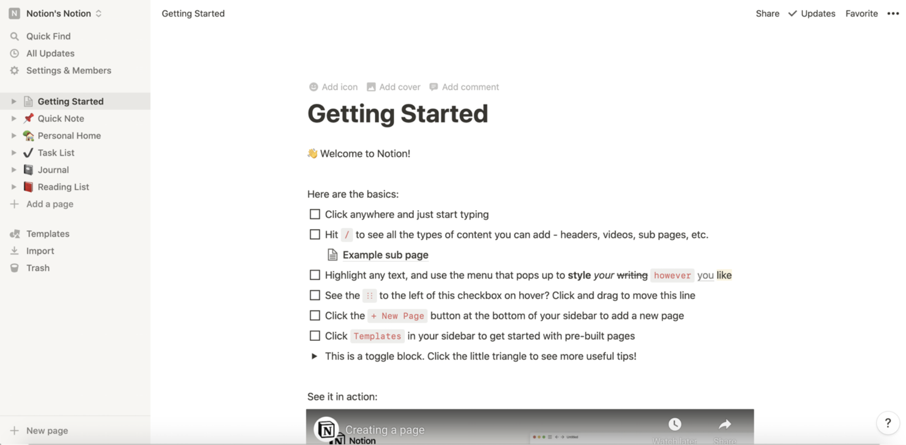
There is a large span of text that expects the user to willfully go through every prompt. There is a brief explanation of content but doesn't go through databases or how to work the app.
As a new user, Notion brings you to the "Getting Started" page where you read the basics, then must watch multiple 1 minute videos for the explanation of more difficult tasks.

User Flows
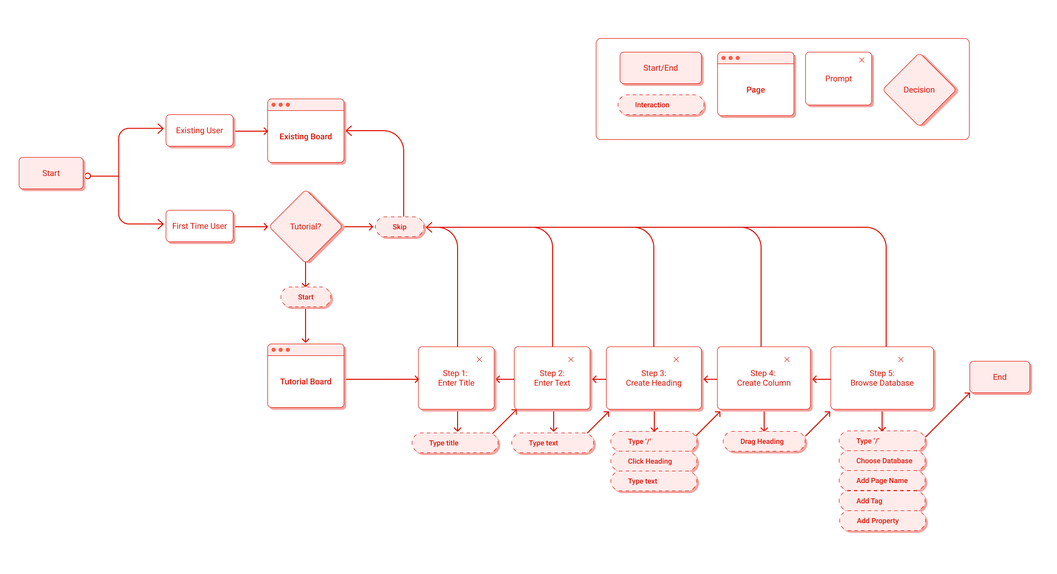
The three user flows represent the three different solutions I have come up with. Addressing all the pain points, I wanted to create a streamline process that would be easy to follow for the user. The tutorial is optional and follows the first-time user through the steps of creating a page, columns, and databases. The toolbar will be static on the page but can be hidden if desired. It includes aspects to personalize the text how they want. Lastly, the folder system would allow users to nest information without having to create separate pages for each one of them.
Onboarding

Creating Folders

Customization Bar

Wireframe

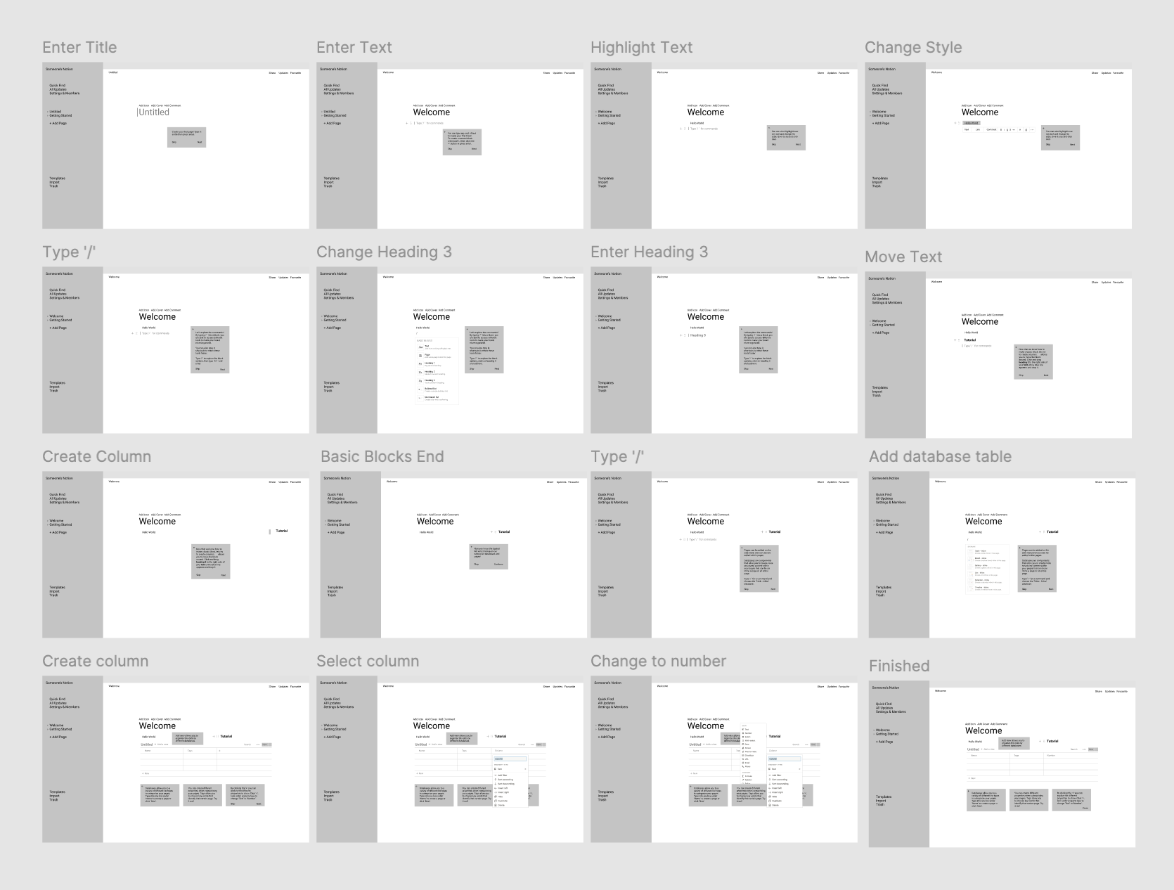
Wireframes stuck to the general layout of the Notion interface. There is no design system related to Notion online, therefore the design was created by myself. Pop up modals would appear when you enter the tutorial and guide you along the basic steps.
Wireframe Usability Testing
Summary
For the main testing, 4 participants were chosen because they had never used Notion before. Individuals were split up into two separate groups. One group would be tested with the tutorial wireframe and the other would be tested with the "Getting Started" page on Notion. After a set time, they would be given a series of tasks to follow on the Notion platform and tested for speed and accuracy. Lastly, they were tested on the additional features created from the insights. An additional 7 participants were tested on Useberry for overall experience.
Findings
Overall experience of the tutorial interviews were positive. 100% success rate and completion for tasks. Individuals who didn't take the tutorial spent a longer time with the tasks (~17 vs 13 mins). If an interviewee watched a video, they would've spent 2-3 minutes doing so, which reduced the amount of time they interacted with the page.
The amount of text instruction, font size, and button size were factors to some confusion and misclicks (~50%). This was to be expected since the wireframe does not allow for typing and dragging.
Both groups found it difficult to grasp the concept of databases and how to create columns. The lines that appear to drag items is not intuitive and is quite a hassle to arrange.
Prototype
A basic folder system that functions similarly to the addition of pages can be easily integrated within the system for users to quickly learn. Folders will allow the user to nest information without having to create excess pages and show and hide them to save space.
The customization bar can be used to edit styles within the text. Users can create more personalized boards and be more expressive in their design. Having the bar at a fixed location, allows for less struggle with previously glitchy toolbar that only appears when highlighting a text.
Full Tutorial
Usability Testing
User testing was performed on the prototype with 6 participants. Misclick rate decreased to 29%. Prototype included a better depiction of the columns and misclick rate decreased. Duration that it took to take the tasks also decreased from 5 to 3 mins between user testings.
Improvements + Takeaways
To improve misclicks during the tutorial, highlighted sections need to emphasize the instructions to guide first time users. The dropdown menu for commands/databases showed higher rates of misclicks, therefore the functionality of the menu should be investigated further.
There is a difficult balance between creating meaningful tutorial description without making them too long and boring to read.
User testing is extremely important because what you might think is a logical flow might be confusing for others.
There is a difficult balance between creating meaningful tutorial description without making them too long and boring to read.
User testing is extremely important because what you might think is a logical flow might be confusing for others.